


Didot
Spring 2020 | Typography | Design History |
Spring 2020 | Typography | Design History |
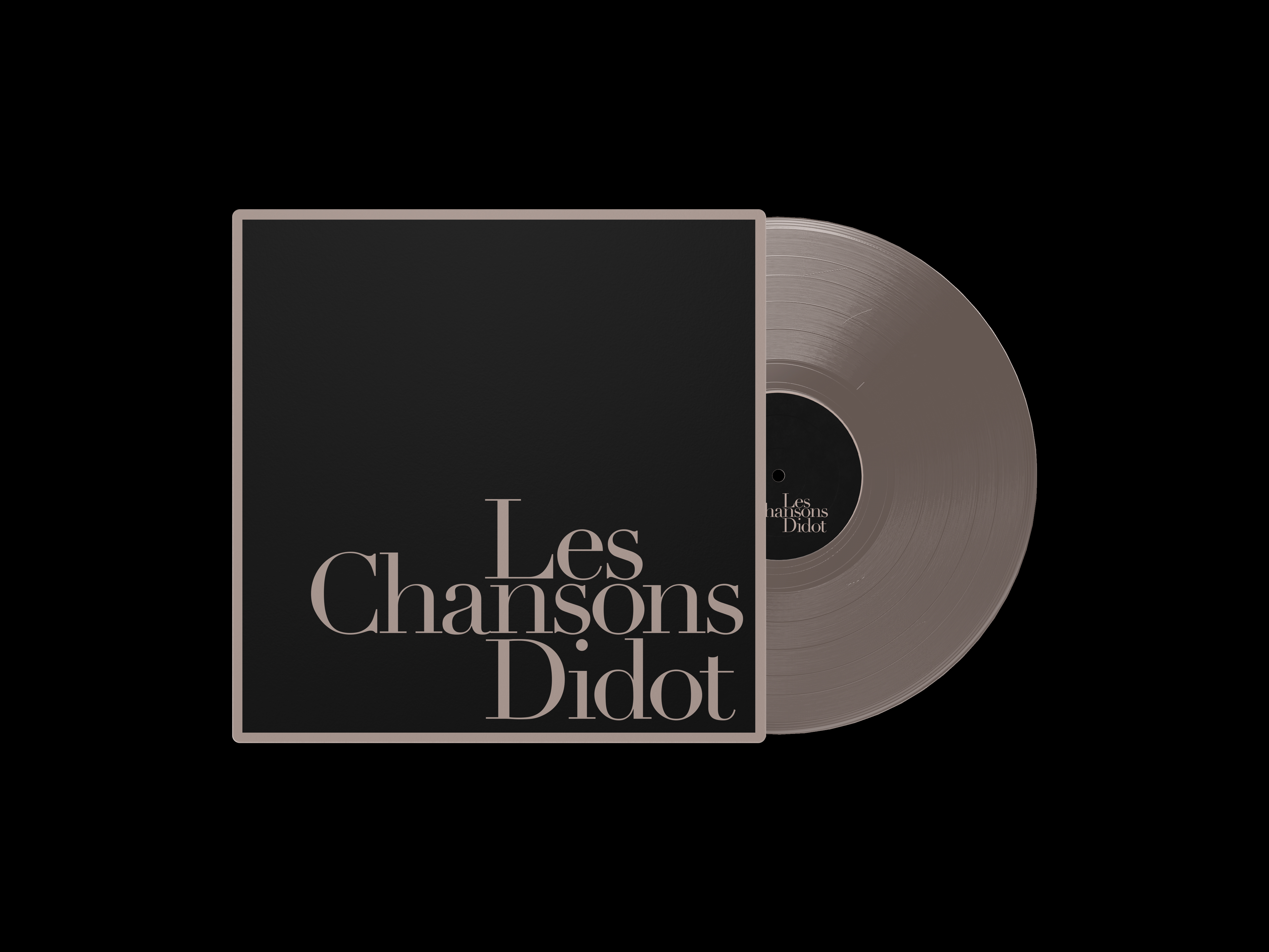
Didot is a group of typefaces named after the famous French printing and type-producing Didot family. The classification is known as modern, or Didone.
The most famous Didot typefaces were developed in the period 1784–1811. Firmin Didot (1764–1836) cut the letters and cast them as type in Paris. His brother, Pierre Didot (1760–1853) used the types in printing. His edition of La Henriade by Voltaire in 1818 is considered his masterwork. The typeface takes inspiration from John Baskerville's experimentation with increasing stroke contrast and a more condensed armature. The Didot family's development of a high-contrast typeface with increased stress is contemporary to similar faces developed by Giambattista Bodoni in Italy.
The most famous Didot typefaces were developed in the period 1784–1811. Firmin Didot (1764–1836) cut the letters and cast them as type in Paris. His brother, Pierre Didot (1760–1853) used the types in printing. His edition of La Henriade by Voltaire in 1818 is considered his masterwork. The typeface takes inspiration from John Baskerville's experimentation with increasing stroke contrast and a more condensed armature. The Didot family's development of a high-contrast typeface with increased stress is contemporary to similar faces developed by Giambattista Bodoni in Italy.